
Having decided on a concept, it is time to bring it to the level of product. This is done via a detailed design phase, where the functionalities, materials and production processes for the product are worked out. Moreover, the colour palette and marketing aspects are decided on. This phase also results in a prototype to clearly communicate the design.
Detailed design
Marketing
Mycelio, as the newest addition to the impressive Nespresso portfolio is an important innovation in single serve coffee consumption. The product makes it effortless for the customer to contribute to a more sustainable world.
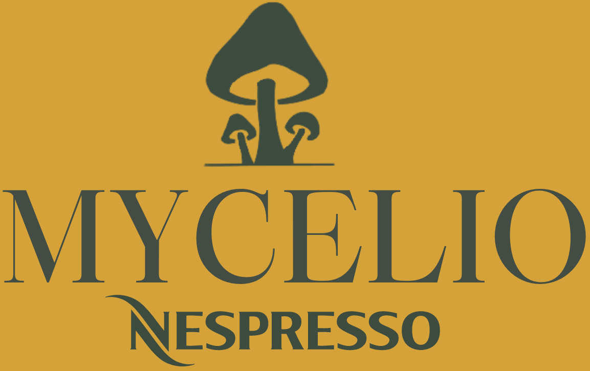
Mycelio, a name that sparks quality, taste and innovation is a portmanteau of the English and Italian name of the innovative material that makes the discs sustainable - mycelium. The English Mycelium is combined with the Italian word Micelio giving rise to Mycelio. It is decided to use the English word, because it is a universal language, just like the splendid taste of the coffee. Next to that, the y reminds of innovation, while the Italian word brings luxury and nostalgia of the beautiful coffee culture of Italy.
The Mycelio logo is still unfamiliar to coffee users, however, the product forms a family with other Nespresso product lines. It symbolised the new and fresh direction for a quality and respected company. The mushrooms on the logo remind of nature and eco-friendliness, not to forget, the they are the ground for the innovative material used in the Mycelio discs, mycelium. Mushrooms usually meant the end of life, but now signal a beginning of effective sustainability. The circle is round. The font of the text in the logo reminds of the classis coffee culture. A culture full of aromas, beautiful tastes and blends. The new logo will not replace the Nespresso logo, it will support this product line to fully emerge as a new innovative, revolutionary and sustainable solution.

Ideation behind logo

Mycelio promotional poster

Mycelio product line identity